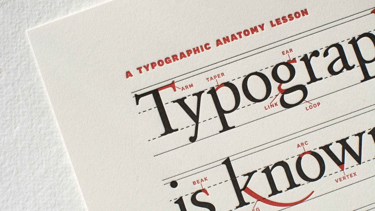
Typography is an art form that transcends language. The choice of fonts can make a profound impact on how a message is perceived. Among the diverse world of fonts, serif fonts stand out as a timeless and elegant choice. These fonts have graced books, newspapers, and digital screens for centuries, and they continue to be a hallmark of classic design. In this exploration of serif fonts, we delve into their history, characteristics, and why they remain a beloved choice in the world of typography.
A Glimpse into History:
- The Origins of Serifs:
Serif fonts find their origins in Roman inscriptions, where letters were chiseled into stone. The “serifs” are the small decorative strokes that extend from the ends of characters, a feature designed to make the letters easier to read. As time passed, serifs became an integral part of written communication.
- Renaissance Revival:
During the Renaissance, typography experienced a renaissance of its own. Designers like Claude Garamond and Francesco Griffo played key roles in shaping the modern serif fonts we recognize today. These fonts became synonymous with the elegant typefaces found in the first printed books.
The Characteristics of Serif Fonts:
- Elegance and Tradition:
Serif fonts exude an air of tradition and sophistication. Their classic appearance is often associated with literature, fine printing, and academia. This makes them a popular choice for books, newspapers, and formal documents.
- Enhanced Legibility:
The serifs, or small lines at the end of characters, assist in guiding the eye along the text. This feature improves the legibility of serif fonts, especially in lengthy bodies of text. For this reason, they remain a staple in book design.
- Subcategories of Serifs:
Serif fonts are not a one-size-fits-all category. There are various subcategories, including Old Style, Transitional, Didone, and Slab Serif, each with its unique characteristics. These subcategories allow designers to choose the style that best fits the project’s requirements.
Serif Fonts in the Digital Age:
- Web-Friendly Serifs:
As digital communication became dominant, serif fonts needed to adapt. Designers began to craft web-friendly serif fonts that maintained their elegance while ensuring readability on screens of all sizes.
- Logo and Branding:
Many iconic logos and brands leverage the timelessness of serif fonts. Companies like Vogue, The New York Times, and Rolex have chosen serif fonts for their logos, imparting a sense of refinement and trustworthiness.
Conclusion
In the fast-paced, ever-changing world of design, serif fonts continue to hold their own. They are a reminder that in a digital age, where new trends emerge daily, some design elements remain timeless. Serif fonts embody a rich history, a sense of tradition, and a unique style that has transcended centuries. They remain the epitome of elegance in typography, standing as a testament to the enduring power of classic design.
Whether it’s the pages of a classic novel, the headlines of a newspaper, or the website of a high-end fashion brand, serif fonts will continue to play a pivotal role in the world of design, ensuring that the timeless elegance they represent is never forgotten.


